Initial research.
Discussing with the team about the older version metrics.
Interviewing current (at the time) users.
The onboarding flow was cluttered and didn’t have important steps and UX was flawed.
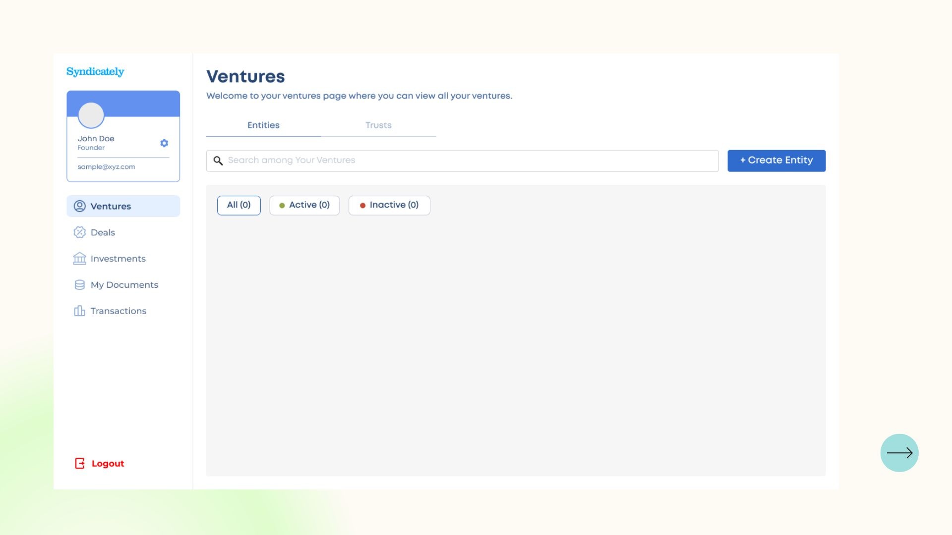
The dashboard options were confusing and the UX was over complicated.
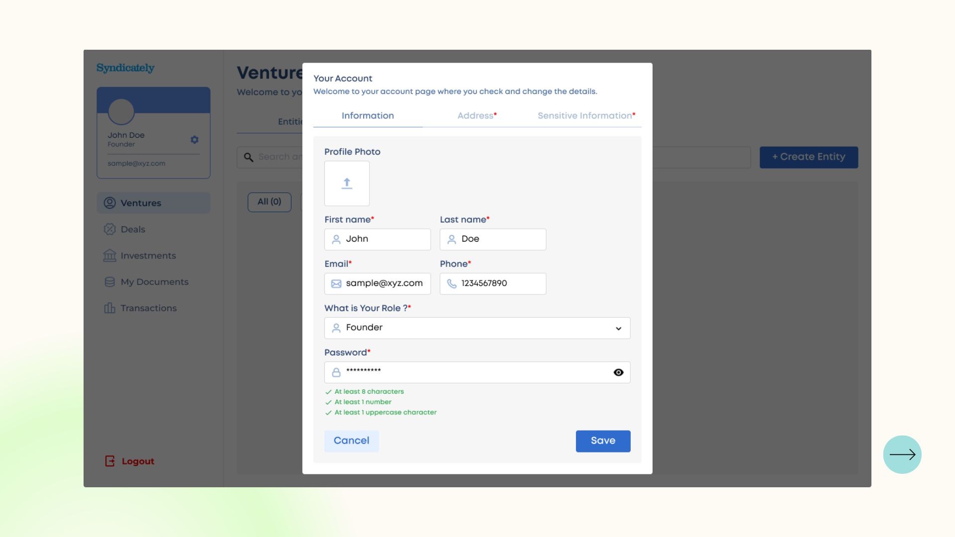
Profile section was merged with other option and was not clear to the user.
Simplifying the Onboarding UX process.
Making the dashboard UX better and improving UI.
Re-structuring the profile section with better UX and improving UI.
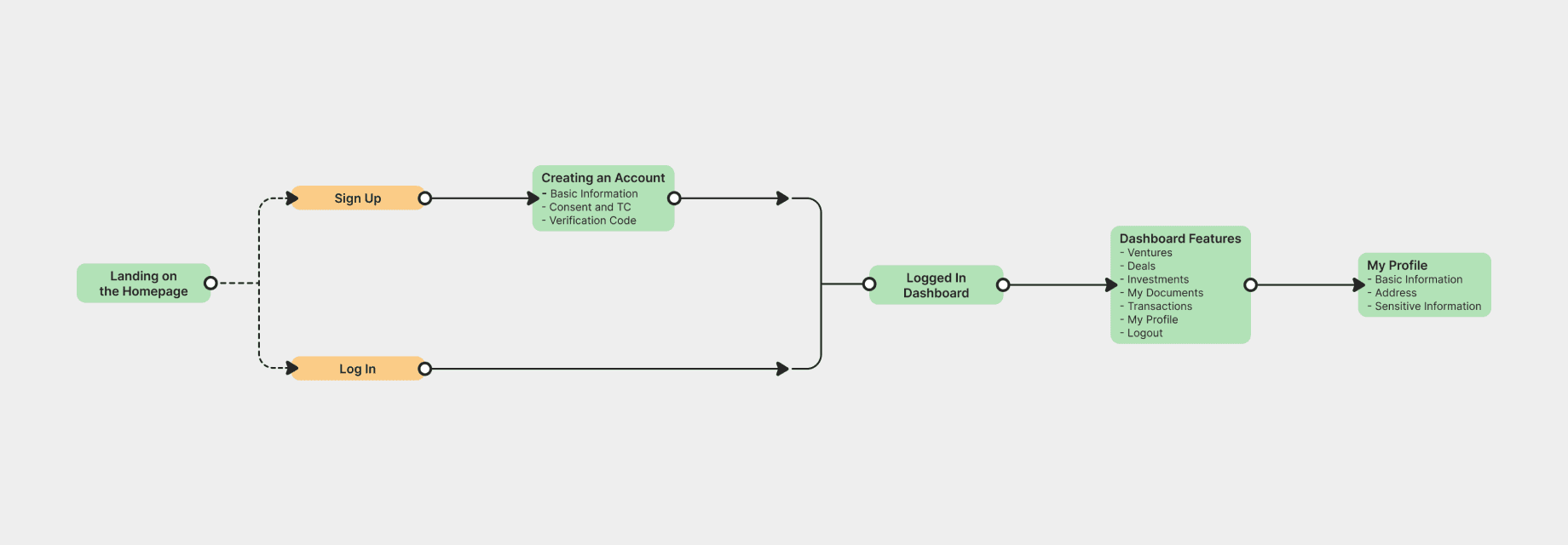
Onboarding UX flow improvements.
Profile UX flow improvements.
Dashboard UX flow improvements.
UX Flow (Simplified)
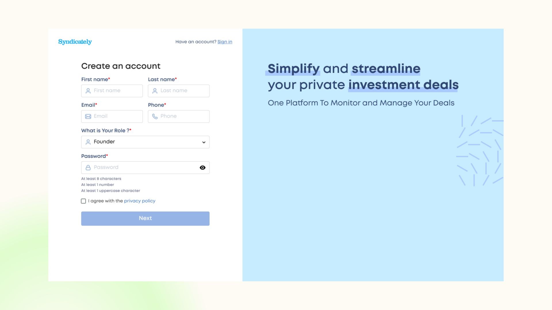
Onboarding flow was missing minute details such as * for important fields, minimum password requirements and some fields which were important for investments and other stuff to work properly so those were the first things to be implemented.
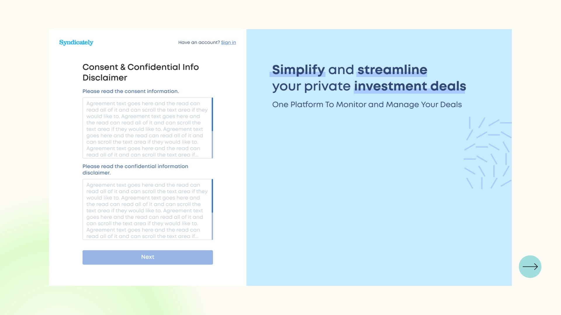
A consent and important info disclaimer was also added so users knows everything regarding investments and don’t think they missed anything.
Profile section didn’t have a clear UX or a menu so that was rectified by making a new flow for profile and clearing indicating it on the left menu.
Onboarding - Creating an Account
Onboarding - T&C.
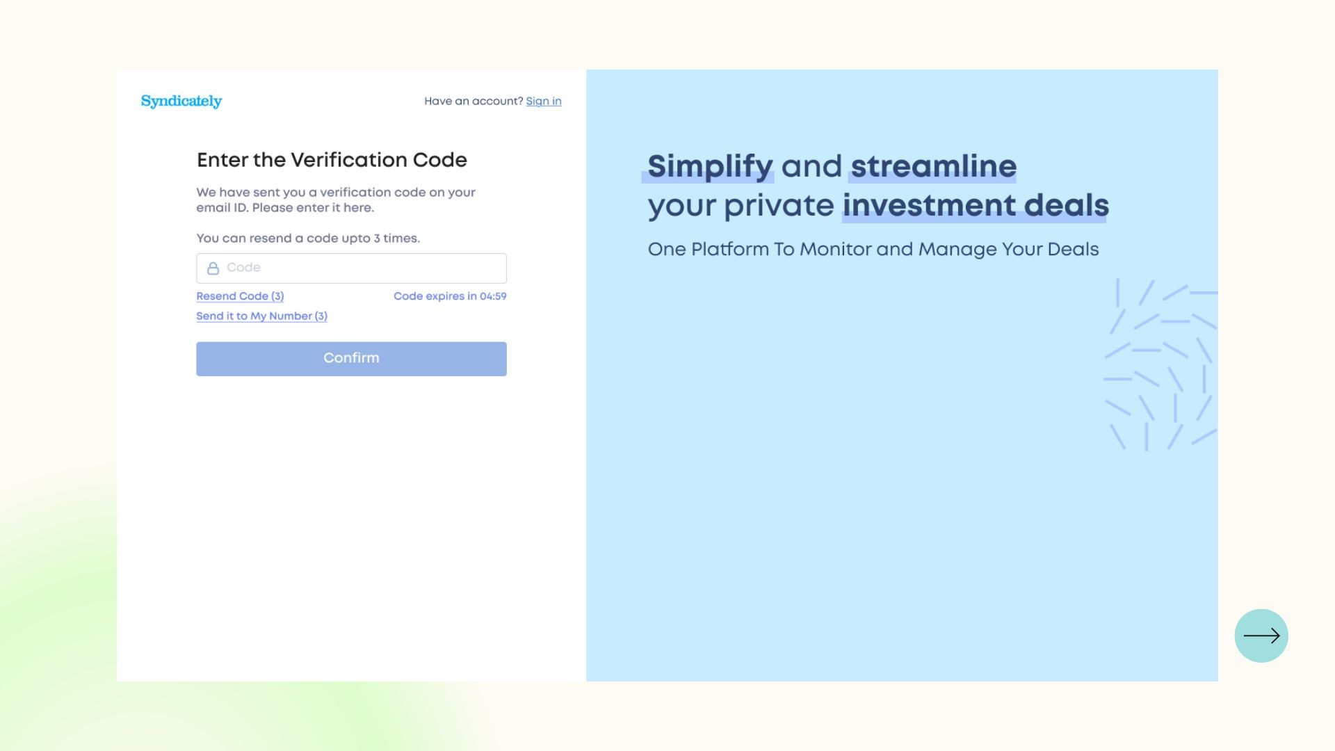
Onboarding - Entering Code
Dashboard - Ventures
Profile
